Pareto Chart
All bar charts are not created equal, and Vilfredo Pareto unlocked a gem when he came up with this one. It’s tightly related to the 80/20 rule - roughly 80% of consequences will come from about 20% of causes - and you want to be able to identify and address that 20%. In manufacturing, it’s commonly used to understand defects and causes of downtime, and where you should put the bulk of your Root Cause Corrective Action efforts.
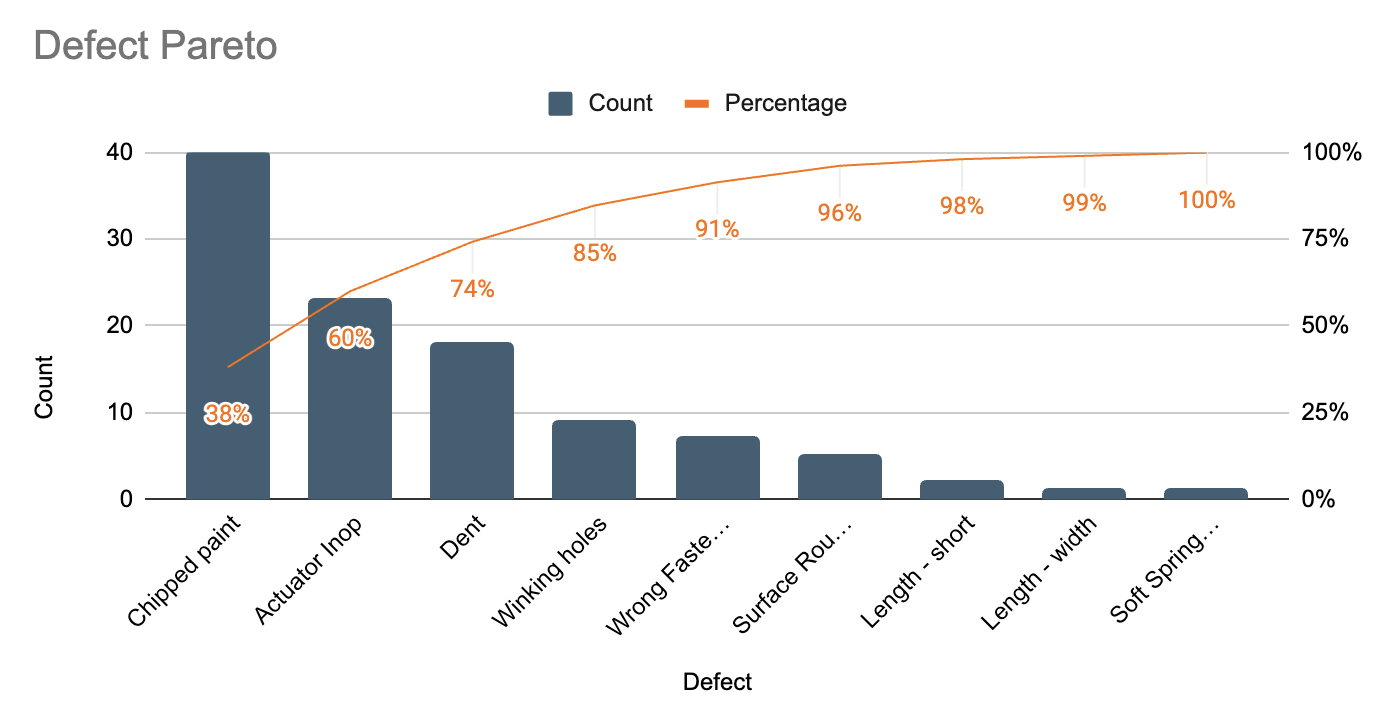
Here’s an example of a Pareto chart, note the ranked bar chart of defects, as well as the cumulative % contribution of each defect.

In this example, the top 3 defects (Chipped Paint, Actuator Inop, and Dents) account for 74% of all issues - fixing them will pay huge dividends, and you should focus your efforts there before dealing with length or spring tension issues.
A lot has been written about this topic, and you can dig into more at both lean.org and on wikipedia


